Introduction:
Designing flawless brochures, posters, and business cards involves a seamless journey from concept to print. However, a widespread misconception often disrupts this process. Many believe that prepress and printing should exclusively rest in the hands of print shop experts. But let’s set the record straight: this isn’t the most effective approach.
Prepress refers to the crucial tasks performed to optimize your design before it’s sent for printing. However, the trouble begins when you let non-designers tweak a designer’s file. These changes might unintentionally alter the design and lead to a different outcome than planned. Imagine your design losing its magic when it goes from your computer to the print shop.
The smart solution? Work with a prepress graphic designer who understands the intricacies of prepress services. They carefully go through your design step by step before it is ready for print process. This keeps your creative vision intact, saves time and stress, and even cuts costs.
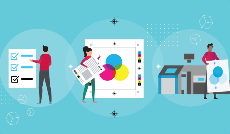
To guide you, we’ve put together an easy prepress checklist curated by our prepress service experts; it covers everything to ensure your design looks perfect in the final proof.
7 Vital Graphic Design Prepress Checklist For Digital Printing
Proofreading
A print-ready design begins with a meticulous proofreading process. Even tiny mistakes like grammar errors and typos can hurt sales. Research shows that while some potential customers might overlook these errors, most won’t.
This means you risk losing a significant portion of your audience. When people spot mistakes, they might stop reading and decide not to buy the product. That’s why fixing such errors is crucial before your design is printed and reaches a wide audience.
You need to take care of two types of proofreading:
Linguistic Proofreading
It involves checking for typos, grammatical mistakes, spelling errors, sentence structure, and the overall flow of the content.
Prepress Proofreading
Prepress proofreading also known as graphic proofreading, focuses on visual aspects or the texts. A prepress service professional will look for words split at the end of line breaks, the length of lines, and even the spacing between texts.
One important thing to remember is to maintain consistent line lengths when breaking sentences. If lines are too long or short, they stand out and can disrupt the overall uniformity in a text block if not spaced properly.
Right Font Spacing
Once you have completed the proofreading phase, it’s time to focus on font spacing. While most fonts and design software come with standard settings, depending solely on them can sometimes lead to a slightly uneven look.
To make things perfect, it’s important to adjust how your text is spaced. You can do this by changing the leading, tracking, and kerning. These adjustments are crucial for crafting a unique style that makes your design stand out and gives viewers a cohesive and captivating visual experience.
Although it might all seem like a simple step, it requires an expert eye. That’s why collaborating with prepress experts like Alpha BPO (yes, that’s us) can simplify the process. We understand font spacing intricacies and ensure your design’s typography is flawlessly precise.
Image Size and Resolution
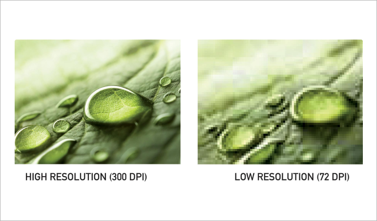
Another crucial step before your design becomes the printer is ensuring flawless images. This covers both the quality of the photos in your design and the resolution when you save the final version. It’s a good idea to save your items at 300 DPI or even higher.
Our digital prepress experts always stick to the principle of saving design files at the highest possible resolution. The reason is simple: reducing the size of an image if needed is possible, but adding pixels later is not.
Expert Tip: Avoid increasing a photo’s size by over 20 percent from the original. Changing image sizes within your document directly affects the image’s quality when printed. This advice holds especially true for larger print items like flyers, brochures, and advertisements featuring high-quality images. However, if you’re printing on canvas, a resolution of 100 DPI can work well for sizes up to a certain point.
Matching Colors: A Key Printing Consideration
When you print your design, the colors you see on your screen may not exactly match what the printer produces. To ensure accurate colors, review your design’s color mode settings.
Computer screens and digital cameras perceive colors and light differently from printers. Not aligning these color modes can lead to unsatisfactory prints. Devices that display or capture light use the RGB color mode to create various colors. Mixing light in these primary colors is straightforward.
Most design software operates in the RGB color mode. Printers, on the other hand, use the CMYK color mode. They layer cyan, magenta, yellow, and black inks to generate a spectrum of colors. This process contrasts with RGB, where colors blend to create darker tones, not lighter ones.
In essence, if your computer and printer employ different color modes, your print might not reflect your intentions. So, configure your program to the printer’s color mode, CMYK. This is a pivotal aspect of our color management services, which involves aligning the mode with the printer and performing screen calibration.
Screen calibration is the process of testing how colors appear on different screens. For better understanding, we also print a sample. While the printed colors might not match those from a professional printer, this step helps us detect minor discrepancies that might go unnoticed on the screen. By adhering to these steps, our experts ensure the colors in your design look splendid when printed and eliminate any potential confusion.
Understanding Bleed and Crop Marks for Print
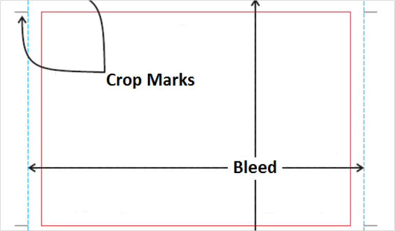
When you’re ready to turn your digital design into a physical reality, it’s important to grasp the concepts of bleed and crop marks. These two factors are key in ensuring your design looks just as you intended on the printed page.
Bleed
Think of bleed as the safety margin for your design. The extra space around the edges extends past the page’s boundary. This buffer accounts for any small shifts during the cutting process. By having a bleed, you avoid ending up with unwanted white borders and ensure that your design elements, like text and images, reach the very edge of the page for a polished and professional appearance.
Crop Marks
Crop marks are like guiding signposts for the printer’s blade. They indicate where the final cuts will be made on your printed piece. These marks help ensure that your design maintains its intended dimensions and looks precisely how you designed it.
It’s also worth caring for the slug, an area outside the bleed. This space holds essential printer instructions, extra print details, and other important information about the job. Another important consideration is the paper’s cutting tolerance, especially if your text or images align with the crop edge or a fold.
Neglecting proper bleed can lead to unsightly white borders along the edges of your printed piece, diminishing the entire visual appeal of your work. This is exactly where the expertise of professional prepress services shines. They possess the technical know-how to ensure your design aligns seamlessly with printing and finishing processes, resulting in a final piece that’s polished and well-proportioned.
Imposition
In printing, imposition is a crucial prepress step that involves strategically arranging pages or artwork on press sheets. This arrangement ensures that the print job runs efficiently and precisely from start to finish, helping print faster and minimizing paper waste.
But imposition is more than just arranging things neatly. Our digital prepress experts take it further by adding essential marks required by printing presses and finishing machines. These marks include cutting indicators, color bars, and collation marks. Together, these elements ensure a precise printing process.
Selecting the Perfect Paper
After completing all the preceding steps and finalizing your design, saving your proof in PDF format is recommended. PDF files are ideal for maintaining quality. The last consideration before sending your design to the print shop is choosing the right paper. Various paper types provide unique textures and visual effects, so take a moment to contemplate the impact you want to achieve before printing.
Partner with Prepress Specialist For Flawless Output
Now that you understand the importance of prepress checklist for your artwork before printing, it’s time to implement these steps for precise printing results. However, amidst your various tasks, it’s easy to overlook these nuances. And once things are printed, rectifying errors can be quite challenging. This is why you need to outsource your prepress needs to prepress specialist like Alpha BPO.
Our comprehensive prepress solutions are carefully designed to catch even the smallest errors, which could magnify when they reach the print shop. Although these mistakes might seem insignificant, they can disrupt the hard work you’ve invested in your design.
So, let us take care of your prepress needs, ensuring a seamless transition from your digital creation to the final print, just the way you envisioned it.